
Spoiler: yes, and we’ll explain why
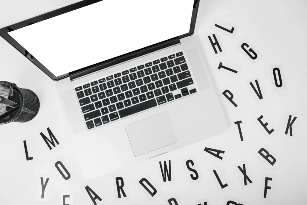
In the world of B2B marketing, where purchasing decisions are complex, rational, and involve multiple stakeholders, building a strong brand cannot rely solely on the message or the channel. Every visual element serves a strategic function, and one of the most underestimated is typography.
Leading companies like Salesforce, IBM, or Siemens do not leave the choice of their typefaces to chance. They use typography as another asset of their visual identity, aligned with their positioning, their values, and the type of client they aim to reach.
Why is typography so important in B2B branding?
A good typographic choice is not just about “what looks good.” It’s what conveys stability, professionalism, innovation, or tradition.
And in B2B, where building trust is essential, every visual detail helps (or hinders) that perception.
Recent studies show that:
Get to know your customer deeply
Typography that is consistent with brand identity improves visual recall by 13%.
Increases time spent on pages and materials by up to 38%.
And raises perceived credibility, especially in sectors such as technology, industry, or professional services.
Examples that point the way:
Salesforce uses a flexible, modern, and clean typographic system that reinforces its proposal as an open, innovative, and human platform.
IBM, with its history rooted in Swiss design, it developed its own type family (IBM Plex) to reflect precision, scale, and global consistency.
Siemens maintains a sober, technical typographic aesthetic aligned with its values of engineering, robustness, and technological innovation.
None of these decisions were aesthetic. They were strategic decisions.
And how do we apply this at MarkLovers?
At our consultancy, we work with B2B brands that need more than a good-looking logo. They need visual consistency, a distinct voice, and an image that lives up to their value proposition.
And that’s where typography comes into play as well.
From complete rebrandings to brand manuals and digital platforms, we help our clients choose and apply typefaces that are not only legible, but that communicate what the brand stands for.
Typography is a silent language that directly influences how your clients perceive your brand.
If you’re building a B2B brand identity, asking “which typography should we use?” is not a minor detail. It’s a strategic decision.

Want to know if your visual identity truly communicates what you sell?
Let’s talk: www.marklovers.com